Req 1b — Title Block Lettering
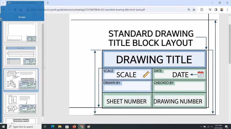
The title block is the professional ID card of every engineering drawing. It sits in the lower-right corner of the sheet and tells anyone who picks up the drawing exactly what they are looking at, who made it, when it was made, and at what scale. A drawing without a properly filled title block is like a letter without a return address — useless in a professional setting.
What Goes in a Title Block?
A standard title block contains these fields:
| Field | Purpose | Example |
|---|---|---|
| Drawing Title | Name of the object or project | “FIRST FLOOR PLAN” |
| Drawing Number | Unique identifier | “DWG-001” |
| Scale | Ratio of drawing to actual size | “1/4” = 1’-0"" or “1:2” |
| Date | When the drawing was completed | “03/04/2026” |
| Drawn By | Drafter’s name or initials | “JDS” |
| Checked By | Reviewer’s name or initials | (left blank or filled later) |
| Sheet Number | Which sheet in a set | “1 OF 2” |
| Material | What the part is made of | “6061 ALUMINUM” |
| Tolerances | Allowable variation | “±0.01” |
Not every title block uses all of these fields. For this merit badge, include at least the drawing title, your name, the date, the scale, and the drawing number.
Drawing the Border and Title Block
Before you letter anything, you need to draw the border and title block outline on your formatted sheet:
Border lines: Draw a border around the sheet, leaving a 1/2-inch margin on the top, bottom, and right sides. Leave a 1-inch margin on the left side (this extra space is for binding if the drawing set is stapled or hole-punched).
Title block outline: In the lower-right corner, draw a rectangle approximately 4.5 inches wide by 1.5 inches tall. Subdivide it with horizontal and vertical lines to create cells for each field.
Line weight: The border and title block outlines should be drawn with a thick, dark line. Use a softer pencil (like an HB or B) or press firmly with your mechanical pencil.
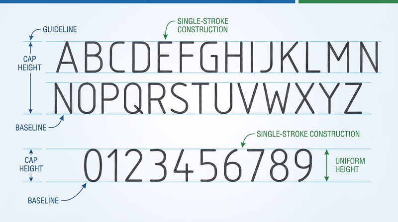
Gothic Lettering Basics
Gothic lettering — also called single-stroke lettering — is the standard lettering style for engineering drawings. It is designed to be clear, fast, and unmistakable. Every stroke is a single pass of the pencil, with no thick-and-thin variation.
You have two style choices:
Vertical Gothic — Letters stand straight up at 90 degrees. This is the most common style and generally easier for beginners.
Slant Gothic — Letters lean to the right at about 68 degrees from horizontal. Some drafters find this style more natural because it mimics cursive handwriting posture.
Pick one style and use it consistently throughout all your drawings. Mixing vertical and slant lettering on the same drawing looks unprofessional.
Lettering Technique
Good Gothic lettering comes down to consistent habits:
- Pencil choice: Use a sharp, medium-weight pencil (H or HB) for lettering. Too soft and the letters smear; too hard and they are faint.
- Stroke direction: Form vertical strokes from top to bottom, horizontal strokes from left to right. This produces the cleanest, most consistent lines.
- Spacing: Leave consistent space between letters. The spacing should look even to the eye, which means the actual distance varies — letters with open sides (like L and T) need slightly less space between them than letters with closed sides (like M and W).
- Uniformity: All letters of the same size should be exactly the same height. All vertical strokes should be exactly vertical (or at the same slant angle). This consistency is what makes professional lettering readable.
Practice Before the Final Sheet
Before lettering your actual title blocks, practice on scrap paper:
- Draw sets of horizontal guidelines at 1/8-inch spacing
- Letter the full alphabet (uppercase only — Gothic lettering uses ALL CAPS)
- Letter the numerals 0 through 9
- Practice your name, today’s date, and a sample drawing title
- Check that your letters are uniform in height and spacing
Once your lettering is consistent and confident, fill in the title blocks on both formatted sheets — the one for your manual drawing (Requirement 2) and the one for your lettering project (Requirement 6).
Title Block Completion Checklist
Verify before moving on
- Border drawn with correct margins (1 inch left, 1/2 inch other sides).
- Title block rectangle drawn in the lower-right corner.
- Title block subdivided into labeled cells.
- All lettering uses consistent Gothic style (vertical OR slant, not mixed).
- Guidelines visible or lightly erased.
- Text is legible, uniform in height, and dark enough to reproduce clearly.
- Both sheets (manual drawing and lettering project) are formatted and lettered.
With your sheets formatted, bordered, and titled, you are ready for the main event — creating your manual drafting project.