Graphic Arts Merit Badge — Complete Digital Resource Guide
https://merit-badge.university/merit-badges/graphic-arts/guide/
Introduction & Overview
Graphic arts is the world of turning ideas into things people can hold, read, wear, post, mail, and share. Every poster, cereal box, concert shirt, yearbook, sticker sheet, and newspaper page had to be designed, prepared, printed, and finished by somebody who understood both creativity and process. This badge helps you see how art, communication, technology, and hands-on production all work together.
Then and Now
Then
Long before computers, printers built pages by hand. Workers set individual metal letters into frames, rolled ink onto raised surfaces, and pressed paper against them one sheet at a time. Books, newspapers, posters, and announcements took skill, patience, and teamwork. A mistake in one line of type meant stopping, removing the wrong piece, and resetting the page.
As printing improved, new methods made it possible to produce clearer images and larger quantities. Lithography used the way oil and water repel each other. Screen printing pushed ink through mesh openings. Gravure etched images into cylinders for extremely fast, high-volume printing. Each process solved a different problem: speed, detail, cost, or flexibility.
Now
Today, graphic arts includes both traditional print shops and digital production studios. A designer might create a flyer on a laptop, send it to a digital press, proof it on a screen, and have finished copies within minutes. Large commercial jobs still use specialized equipment for offset, flexographic, gravure, and finishing work because those machines remain efficient for certain products.
Graphic arts also reaches beyond paper. The same design thinking shows up in shirts, packaging, decals, signs, labels, menus, and social media graphics. Even in a digital world, printed communication still matters because physical design can grab attention, organize information, and leave a lasting impression.
Get Ready!
This badge lets you think like both an artist and a builder. You will compare real printing methods, make design choices, choose the right production path, and look at how people turn creative ideas into real printed products.
Kinds of Graphic Arts
Editorial and Publishing Design
This part of graphic arts focuses on things people read: newspapers, magazines, books, programs, newsletters, and brochures. The challenge is not only making the page look good, but also helping readers move through it easily. Headlines, columns, captions, photos, white space, and page order all matter.
Promotional and Advertising Design
Posters, flyers, postcards, stickers, banners, and product displays are built to catch attention fast. Promotional design often uses bold color, strong contrast, short text, and one clear message. In this area, graphic arts is all about helping a viewer notice something and remember it.
Apparel and Specialty Printing
Graphic arts also includes printed shirts, tote bags, labels, decals, and other items that are not standard sheets of paper. Screen printing is especially common here because it works well on fabric and other materials. Specialty printing teaches you that the surface being printed changes the whole production plan.
Packaging and Product Graphics
Boxes, cartons, wrappers, labels, and tags all belong to graphic arts. Packaging has to do several jobs at once: protect the product, carry information, meet legal requirements, and still look appealing on a shelf. That mix of design and practical limits makes packaging one of the most interesting branches of the field.
Next Steps
You are ready to start with the big picture: the main printing processes and how to tell them apart. Once you can recognize how different products are made, the rest of the badge starts to make much more sense.
Req 1 — Printing Processes
A pizza box, a concert T-shirt, a newspaper insert, and a candy wrapper may all look like “printed stuff,” but they were not necessarily made the same way. Graphic arts starts with recognizing that different printing processes solve different problems. Some are best for huge runs. Some are better for fabric. Some are fast for one-day jobs. Your goal in this requirement is to learn what each process does well and how to spot clues in real products.
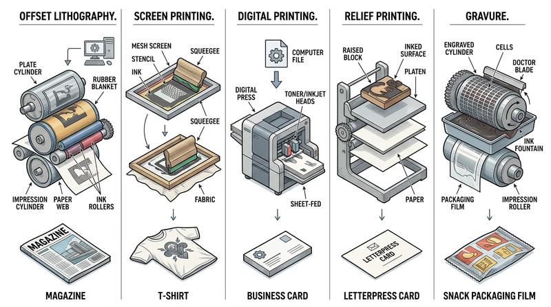
Five Major Printing Processes
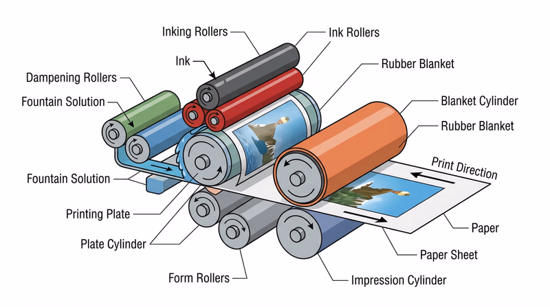
Offset Lithography
Offset lithography is one of the most common commercial printing methods for paper products like magazines, brochures, catalogs, and flyers. It works because oil-based ink and water do not mix. The image area on a plate accepts ink, while the non-image area attracts water and repels ink. The inked image moves from the plate to a rubber blanket and then onto paper.
Why use it? Offset printing is excellent for sharp detail, consistent color, and large quantities. Once the press is set up, it becomes efficient for long print runs. That is why so many books, mailers, and high-quality paper products are made this way.
Clues to look for: smooth coverage, clean text, and strong image quality on paper products printed in quantity.
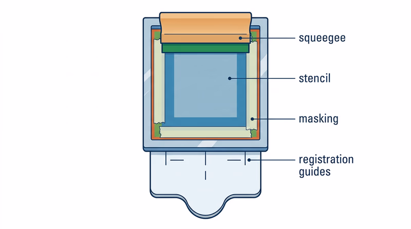
Screen Printing
Screen printing pushes ink through a mesh screen, but only in the open areas of a stencil. The blocked areas do not let ink through, so the image appears only where the stencil allows it. A separate screen is often used for each color.
This process works especially well on materials that are hard to run through a traditional paper press, such as shirts, posters, signs, wood, glass, and some plastics. The ink layer is often thicker than in other methods, which can make colors look bold and feel slightly raised.
Clues to look for: strong, solid color areas, simple layered shapes, and printing on fabric or rigid materials.
Electronic or Digital Printing
Digital printing sends image data directly from a computer to a printer or press without making a traditional plate. This makes it great for short runs, quick turnaround, and variable printing, where each copy can be slightly different.
Think about school programs, troop flyers, short newsletters, and personalized event materials. If you only need a few dozen copies, digital printing usually makes more sense than spending time and money setting up plates or screens.
Clues to look for: short-run pieces, fast production, personalized names or numbers, and work produced directly from a digital file.
Relief Printing
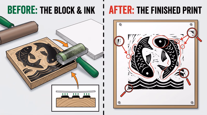
In relief printing, the raised parts of a surface carry the ink. When paper presses against those raised areas, the image transfers. This is one of the oldest printing ideas in the world. Woodcuts, linocuts, rubber stamps, and early letterpress all use relief principles.
Relief printing is important to understand because it shows the basic idea of printing in a very visible way: raised image, ink applied, pressure used, print transferred. It is often taught in classrooms and studios because you can clearly see how the process works.
Clues to look for: impressed texture in some letterpress work, hand-crafted look, bold shapes, and slight variation from print to print.
Gravure
Gravure printing is almost the opposite of relief printing. Instead of raised image areas, the image is cut or etched into tiny recessed cells on a cylinder. Ink fills those cells, excess ink is wiped off the surface, and the remaining ink transfers to the material being printed.
Gravure is used for extremely long runs where speed and consistency matter, such as packaging, catalogs, decorative wraps, and some magazine work. The equipment is expensive, but it becomes worthwhile for huge commercial jobs.
Clues to look for: very consistent high-volume packaging and image reproduction designed for mass production.
How to Compare Them
Compare the Processes
These are the main differences your counselor will expect you to notice- Best material: Offset and gravure are common for paper and packaging; screen printing handles fabric and specialty surfaces; digital works on many short-run jobs; relief often appears in art and specialty printing.
- Setup needed: Offset and gravure require more setup; digital needs the least; screen printing needs a prepared screen; relief needs a carved block, plate, or set type.
- Best quantity: Digital shines for short runs; offset and gravure become more efficient for larger runs; screen printing works well for moderate runs on specialty items.
- Look and feel: Screen printing often leaves thicker ink; relief can show texture; offset gives clean commercial results; digital offers speed and convenience; gravure emphasizes consistency at scale.
Collecting Your Three Samples
The requirement asks you to collect three products made by different processes, or draw diagrams if samples are hard to find. Good sample hunting teaches you to observe like a print professional.
Look around your home, school, troop meeting space, and local stores. A newspaper insert may suggest offset printing. A printed shirt or tote bag may show screen printing. A short-run event handout may be digital. A handmade art print could be relief. Packaging from a national brand may point to gravure or another large-scale commercial process.
Do not guess wildly. Instead, write down what clues led you to your conclusion. Ask questions like these:
- What material is this printed on?
- Does the ink sit on top of the surface or soak in smoothly?
- Is it obviously mass-produced or more hand-crafted?
- Would this job need thousands of copies or just a few?
- Does the product use bold flat color, detailed photos, or personalization?
Diagrams Work Too
If you cannot collect real products, draw simple process diagrams. Your diagrams do not need to look fancy. They just need to show the path of image, ink, and material. For example, an offset diagram might show plate → blanket → paper, while a screen printing diagram might show ink pushed through mesh onto fabric.
That kind of sketch helps you explain what makes each process different. It also gives your counselor something concrete to discuss with you.
🎬 Video: Intro to Printmaking (video) — https://www.youtube.com/watch?v=lNoRrp17SJ4
The video above gives you a broad introduction to multiple printmaking methods. It is especially helpful if you want to see how different processes produce different visual results.
🎬 Video: Learning About Printmaking (video) — https://www.youtube.com/watch?v=ns9_2SfhCtM
This second video is useful for noticing how tools, pressure, ink, and surface interact. Watch for the moments where the process itself shapes the final look.
What to Say to Your Counselor
Be ready to explain each process in plain language. You do not need to sound like an engineer. A strong explanation sounds more like this: “Screen printing uses a stencil and mesh to push ink onto a surface, which is why it works well for shirts” or “Digital printing skips plates, so it is better for short runs and quick jobs.”
This requirement also prepares you for Req 3 — Design Choices and Production Planning and Req 4 — Pick Your Production Path. Once you understand what the presses can do, you can start making smarter design decisions.
Now that you can identify the big printing methods, the next step is understanding the artwork those methods print.
Req 2 — Images, Halftones, and Digital Files
A photograph of your troop at camp, a black-and-white logo, and a comic-style dot pattern may all end up on the same printed page, but they are not built the same way. Printers need to know what kind of artwork they are handling because each type behaves differently when ink hits paper. This requirement is about learning how images are translated from art into printable information.
Three Common Artwork Types
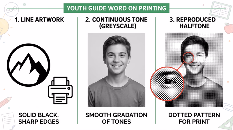
Line Artwork
Line artwork uses solid areas with clear edges and no gradual shading. Think of a troop logo, a simple icon, a map symbol, or bold black text. The image is either there or it is not. That makes line art crisp and easy to reproduce.
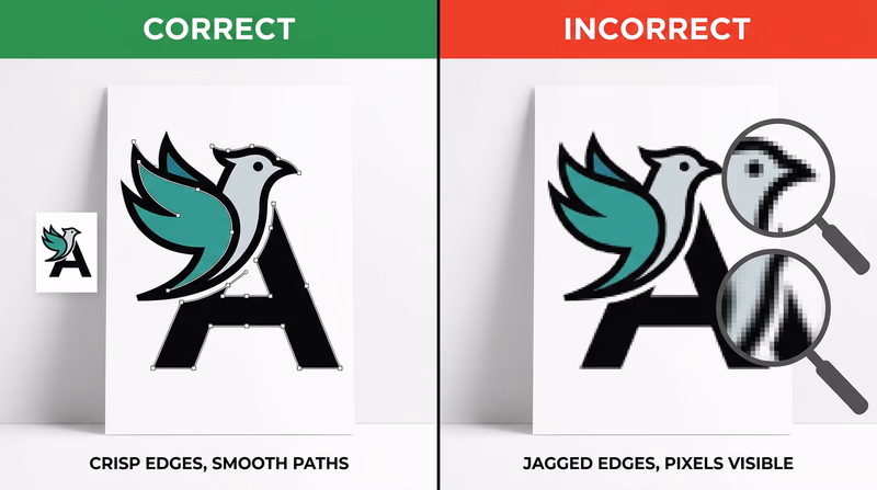
Because the edges are sharp, line art is often stored as vector art or high-contrast bitmap art. Vector art uses mathematical paths instead of individual pixels, which means it can scale larger or smaller without becoming blurry. That is why logos are often created as vectors.
Continuous Tone Artwork
Continuous tone artwork has smooth changes from light to dark. Photographs are the most common example. A face in a photo does not jump from one flat gray shape to another. Instead, it shifts smoothly through many values and colors.
Continuous tone images are great for realism, but printing presses usually cannot place infinite shades of ink. They need a way to simulate those smooth changes.
Halftone Artwork
A halftone is the printer’s trick for turning continuous tone into printable dots. Tiny dots of different sizes, spacing, or density create the illusion of shading. From far away, your eyes blend the dots together and see a photograph-like image.
That is why a newspaper photo may look smooth from your chair but reveal a pattern of dots when you look closely. Halftones are a key bridge between original image data and the physical limits of printing.
Why the Differences Matter
A printer cannot treat all artwork the same way. If you turn a logo into the wrong kind of file, the edges can get fuzzy. If you print a photograph without proper halftone handling, the image can lose detail or look muddy. Good graphic arts work depends on choosing the right kind of art for the job.
Here is a simple way to think about it:
| Artwork type | Best description | Common examples | What to watch for |
|---|---|---|---|
| Line art | Sharp edges, solid fills | Logos, icons, bold illustrations, text | Keep edges crisp and high contrast |
| Continuous tone | Smooth shades and color transitions | Photographs, paintings, airbrushed art | Needs careful image handling for print |
| Halftone | Dot pattern that simulates tone | Printed photos in newspapers and magazines | Dot size and screen quality affect detail |
How Digital Images Are Created
Digital images can start in several ways. You might create them by drawing in design software, photographing a scene with a camera, scanning a sketch, or building shapes and text in a page-layout program. No matter how the image starts, the computer stores it as data.
There are two main digital image systems to understand:
Raster Images
Raster images are made from tiny picture elements called pixels. Every pixel holds color information. Photos from phones and cameras are raster images. They work well for continuous tone pictures because thousands or millions of pixels can capture subtle detail.
The trade-off is that raster images depend on resolution. If you enlarge them too much, they become blurry or blocky.
Vector Images
Vector images are built from points, lines, curves, and shapes described by math. A computer redraws them at whatever size you need. That makes them ideal for logos, lettering, diagrams, and line art.
In graphic arts, many finished designs combine both systems. A flyer might include a vector logo, raster photos, and text arranged together in one layout file.
How Computers Store Images
A computer can store images on an internal drive, an external drive, a memory card, or cloud storage. The more important idea for this badge is that files are saved in formats designed for different needs.
- JPEG or JPG is common for photographs because it keeps file sizes smaller.
- PNG works well when you need transparency or sharp-edged graphics.
- TIFF is often used in high-quality print workflows.
- PDF can package text, graphics, and layout into one print-ready file.
- SVG, AI, or EPS are common vector formats for logos and illustrations.
When you discuss storage with your counselor, explain not just where the file is saved, but also what form it takes. A file format affects quality, editability, and how ready it is for print.
Line Art, Continuous Tone and Halftone (website) This page shows visual examples of line art, continuous tone images, and halftones so you can compare them side by side. Link: Line Art, Continuous Tone and Halftone (website) — https://soma.sbcc.edu/users/Russotti/111/read_mes/111chpt6halftone.htmlThe article above is useful because it lets you see the categories instead of only hearing definitions.
🎬 Video: Halftone Printing Explained for Screen Printers (video) — https://youtu.be/6u-1HjVQliY?si=rrlPTChjb_f5ya8b
This video is especially helpful for understanding how dots turn photos and shading into something a press can reproduce.
🎬 Video: What Is a Digital Image? (video) — https://www.youtube.com/watch?v=TVTn7mYKegY
Watch this with one question in mind: what information is the computer storing so the image can be displayed, edited, and printed later?
A Good Counselor Discussion
A strong answer for this requirement explains both art types and computer storage. For example, you might say that line art has crisp edges and often works well as vector art, continuous tone artwork includes smooth shading like a photo, and halftones use dots to simulate that shading in print. Then you can explain that digital images are created with cameras, scanners, and software and stored as raster or vector files in formats such as JPG, PNG, TIFF, PDF, or SVG.
What you learn here will directly help with Req 3 — Design Choices and Production Planning, where you must design a printed piece and explain why your layout and type choices make sense.
You now understand the basic language of print artwork. Next, you will put that knowledge to work by designing something of your own.
Req 3 — Design Choices and Production Planning
A good printed piece does more than look cool. It has a job to do. A flyer must be readable at a glance. A form must guide the eye in the right order. A T-shirt design has to be bold enough to print well on fabric. This requirement asks you to think like a designer and a production planner at the same time.
Start With Purpose
Before choosing fonts or colors, decide what your printed piece is supposed to accomplish. Ask yourself:
- Who will use it?
- Where will they see it?
- How quickly do they need to understand it?
- Is it meant to inform, advertise, organize, or celebrate?
A troop event flyer, for example, needs one clear headline, important details, and easy-to-read text. A program for a ceremony might need a more formal look. A T-shirt design usually needs fewer words and stronger shapes.
Before You Design
Answer these questions first so your layout decisions make sense- Audience: Who is this for — Scouts, parents, younger kids, or the public?
- Message: What is the one thing they must understand right away?
- Format: Will this be printed on paper, fabric, cardstock, or something else?
- Quantity: Do you need a handful of copies or a large run?
- Viewing distance: Will people hold it in their hands or see it from across a room?
Choosing Typefaces
A typeface is the design of the letters themselves. Typeface choice affects tone, readability, and how professional the piece feels.
A clean sans-serif typeface often works well for posters, flyers, and modern designs because it is simple and easy to scan. A serif typeface can feel more traditional or formal and may work well for programs or longer reading. Decorative typefaces can add personality, but they should be used carefully. If the headline looks exciting but the reader cannot decode it quickly, the design is failing.
A strong explanation to your counselor might sound like this: “I used a bold sans-serif for the headline so people can read it from a distance, and a simpler body font for the details so the information stays clear.”
Arranging the Elements
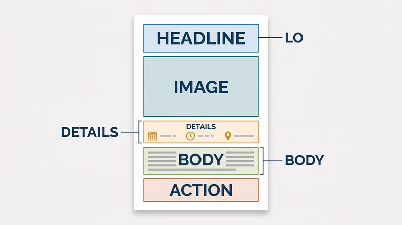
Graphic arts is all about visual order. You decide what the viewer notices first, second, and third. That is called hierarchy.
Important elements often include:
- headline
- image or illustration
- date, time, or location
- body information
- logo or sponsor line
- call to action
You can build hierarchy by changing size, weight, color, contrast, position, and spacing. White space matters too. Empty space is not wasted space. It gives the eye room to rest and helps important parts stand out.
If you crowd everything into the center, the design feels confusing. If you group related items and leave room between sections, the design feels organized and intentional.
Matching the Printing Process to the Design
This is where Req 1 — Printing Processes becomes useful. The best printing method depends on what you designed.
- A T-shirt or fabric item often points to screen printing.
- A short-run flyer or program usually fits digital printing.
- A large paper run such as many brochures or newsletters may fit offset lithography.
- A handmade art-style print could suit relief printing.
- A mass-produced packaging job could point toward gravure.
Your explanation should connect the process to the product. For example: “I chose digital printing because this event flyer only needs 40 copies, and digital printing is fast and does not require plates.” That is much stronger than simply naming a process.
🎬 Video: The Basics of Graphic Design (video) — https://www.youtube.com/watch?v=ZhTNQFWc_qg
This video is helpful for reviewing alignment, contrast, hierarchy, repetition, and white space before you finalize your piece.
🎬 Video: Best Graphic Designing Software (video) — https://www.youtube.com/watch?v=qtHong4fWT4
This video gives you a quick tour of common design software so you can explain which tools fit your project and budget.
Hardware and Software
If desktop publishing is available, your counselor may want to hear how you would actually produce the file. You do not need a fancy studio. You just need to understand the basic workflow.
Hardware
Useful hardware might include:
- a computer or laptop
- a scanner for bringing in sketches or photos
- a camera or phone for original images
- a printer or digital press for proofs or final output
- optional drawing tablet, depending on the design
Software
Useful software might include:
- page layout software for arranging text and images
- illustration software for logos and vector art
- photo editing software for raster images
- presentation or publishing tools if more advanced tools are not available
The best answer depends on your design. A simple troop flyer could be built in a basic layout program and printed on a school or home printer. A more advanced shirt design might call for vector illustration software so the artwork stays sharp.
What Makes a Strong Badge Project
Your piece does not need to be perfect. It does need to show thoughtful choices. A strong project usually has:
- one clear purpose
- readable type
- organized layout
- a process choice that matches the job
- a basic explanation of how it would be produced digitally
This requirement leads directly into Req 4 — Pick Your Production Path, where you will actually produce the design using one printing method. So as you finish your design, think ahead. Which option could you realistically complete with your counselor’s help?
You have designed the piece. Next, you will decide how to bring it to life in print.
Req 4 — Pick Your Production Path
This requirement covers four production paths you can use to turn your design into a real printed job:
- Offset lithography — plate-based printing for larger paper runs
- Screen printing — stencil-based printing for fabric and bold graphics
- Electronic/digital printing — direct file-to-printer output for quick short runs
- Relief printing — raised-surface printing with a hands-on, traditional process
You must choose exactly one option. The best choice is not the fanciest machine. It is the one that matches your design, your counselor’s equipment, and the kind of product you can realistically complete.
Your Options
- Req 4a — Offset Lithography Run: Learn how a plate-based press handles paper jobs with precision and consistency. This option helps you understand commercial print workflow and why setup matters so much.
- Req 4b — Screen Printing Run: Create a stencil, prepare a screen, and print a smaller run with bold ink transfer. This option is great if your design works well on shirts, posters, or other specialty surfaces.
- Req 4c — Digital Printing Run: Send a digital layout straight to a press or printer and produce 50 copies. This option is usually the most accessible and teaches modern short-run workflow.
- Req 4d — Relief Printing Run: Print from a raised image surface such as type or a carved plate. This option teaches the physical roots of printing and shows how pressure and surface create the final image.
How to Choose
Choosing Your Printing Path
Think about your design, your materials, and what you want to learn- Type of product: Digital and offset fit paper jobs well; screen printing is often best for shirts and specialty surfaces; relief fits art-style or traditional print pieces.
- Equipment access: Choose the process your counselor can safely supervise with real tools and enough time to complete the run.
- Setup time: Offset and screen printing need more preparation; digital is usually fastest to start; relief takes careful setup but can be very hands-on.
- What you will gain: Offset teaches commercial accuracy, screen printing teaches stencil and ink control, digital teaches modern file workflow, and relief teaches the physical mechanics of printing.
A good prepress file matters no matter which option you choose. Margins, image quality, color choices, and page size all affect whether the final copies look sharp and professional.
🎬 Video: Prepress Tips - How to Set Up Your Digital Print Files Correctly (video) — https://www.youtube.com/watch?v=QxlB6rl8aNU
That video is useful before any of the four options because it shows how file mistakes can create print problems long before the press starts running.
You have already planned the design. Now pick the production method that makes the most sense and learn the steps for completing it well.
Req 4a — Offset Lithography Run
Offset lithography is the kind of process that rewards careful setup. Once the plate is right and the press is adjusted, it can produce clean, consistent copies over and over. That is why offset printing is so important in commercial paper printing. For this requirement, your job is to understand the workflow well enough to help make a real run happen.
What Happens in Offset Printing
In offset lithography, the image is placed on a plate. Ink sticks to the image areas, while water protects the non-image areas. The image then transfers first to a rubber blanket and only then to the paper. That extra step is why the process is called “offset.”
This method is excellent for brochures, newsletters, flyers, and other paper products that need strong detail and repeatable quality. It is not the simplest process to set up, but it is one of the best for showing how professional print production works.
Your Main Tasks
Offset Run Checklist
Focus on the order of the work, not just the final pile of copies- Prepare the layout: Make sure your design size, margins, images, and text are ready for print.
- Create the plate: Use the approved process your counselor provides.
- Mount and align: Help position the plate and check that the image lands where it should.
- Run test sheets: Examine early copies for registration, coverage, and clarity.
- Print the full run: Once everything looks right, complete at least 50 copies.
What to Watch During Setup
Offset printing depends on precision. If the plate is mounted slightly wrong, the whole job can shift. If the ink-water balance is off, the image can look weak or the page can scum up with unwanted marks. You do not need to master every machine setting for this badge, but you should notice how much accuracy matters before the first good sheet appears.
When talking with your counselor, ask questions like these:
- How is the plate made in this shop?
- What tells you the press is correctly adjusted?
- What defects show up when the settings are wrong?
- Why is offset more practical for some jobs than digital printing?
🎬 Video: Offset Lithography Demonstration (video) — https://youtu.be/e4GmiXXAvuA?si=OA6SjlwBdX0iURxc
This video helps you visualize the plate, blanket, and paper path before you stand next to the equipment.
Signs of a Good Run
A successful offset job usually shows:
- even ink coverage
- sharp text and edges
- consistent placement from copy to copy
- paper feeding smoothly without jams
- final copies that match the approved proof
If one copy looks great but the next ten drift or smear, the run is not truly under control. Offset printing teaches that production quality means consistency, not just one lucky sheet.
This option connects directly back to Req 3 — Design Choices and Production Planning. The cleaner and more print-ready your design is, the smoother the plate and press stage usually goes.
If you decide another method fits your project better, the next page shows the screen printing path.
Req 4b — Screen Printing Run
Screen printing feels different from press-based paper printing because you can see the image form right through the stencil. One pull of ink, one pass across the screen, and the design appears on the surface below. That hands-on quality is one reason this method is popular for shirts, posters, signs, and other bold graphic pieces.
How Screen Printing Works
A mesh screen is stretched tight in a frame. Parts of the mesh are blocked by a stencil, and the open parts let ink pass through. When you pull ink across the screen with a squeegee, the image transfers only through those open areas.
This process works best with strong shapes, limited colors, and designs that do not depend on tiny photographic detail. If your Req 3 — Design Choices and Production Planning project uses bold lettering or large graphic areas, screen printing may be a very smart choice.
The Main Steps
Screen Printing Steps
Build a clean stencil and repeat your process carefully- Finalize the artwork: Simplify shapes and make sure the design suits the surface.
- Create the stencil: Use a hand-cut or photographic method approved by your counselor.
- Attach and mask the screen: Block any areas where stray ink could leak.
- Register the material: Keep each shirt, page, or surface in the same position.
- Print the run: Apply ink consistently and produce at least 20 copies.
Why Masking and Registration Matter
Two common problems in screen printing are ink leaking into the wrong areas and prints landing in slightly different spots. Masking fixes the first problem by covering mesh openings you do not want to print through. Registration helps fix the second by keeping the material lined up the same way every time.
If the first print looks good but the next ones drift up or to the side, your registration needs work. If edges look fuzzy or random smudges appear, you may need better masking, cleaner screen prep, or steadier pressure.
🎬 Video: The Basics of Screen Printing | Screen Printing Tutorial (video) — https://youtu.be/LB__fEeO6no?si=xnEBGmb6WHEazfXl
Watch how the screen is prepared and how the squeegee pressure affects the result.
Making the Run Look Consistent
Screen printing is partly about art and partly about rhythm. The more consistent your motion, pressure, and setup, the more uniform your copies will look. Pay attention to:
- how much ink is on the screen
- the angle and pressure of the squeegee
- whether the screen is seated evenly
- whether each sheet or item is positioned the same way
- drying time between steps, if required
What You Should Be Ready to Explain
Your counselor will want more than proof that you made 20 copies. Be prepared to explain why your design fit screen printing, how the stencil controlled the image, and what steps mattered most for consistency.
Screen printing is a great choice when you want bold graphics, strong color, and a physical connection to the printing process. If you want a more computer-driven workflow, the next option shows how digital printing handles short-run production.
Req 4c — Digital Printing Run
Digital printing is probably the option most people use without even realizing it. School handouts, church bulletins, event programs, and short-run flyers often come straight from a computer file to a printer or digital press. This process is fast, flexible, and practical, which makes it a strong choice for many Scouts completing this badge.
Why Digital Printing Is Different
Unlike offset printing, digital printing does not require a traditional metal plate. The file goes directly from the computer to the machine. That means setup is faster, short runs are easier, and last-minute edits are much less painful.
This option is a great fit for designs that need 50 copies, quick turnaround, and clean paper output. It also connects directly to the digital image concepts you studied in Req 2 — Images, Halftones, and Digital Files.
Your Workflow
Digital Printing Workflow
Focus on file quality before you ever hit print- Build the layout electronically: Use software that keeps text, images, and spacing organized.
- Check the file: Confirm page size, margins, image quality, and readability.
- Send it to the machine: Download or transfer the file to the printer or press.
- Print a proof: Review one or two copies before the full run.
- Produce 50 copies: Run the job once the proof looks correct.
If your counselor does not have a direct electronic interface, the requirement still lets you print a paper copy of the layout and scan it into the system. That is a useful reminder that production workflows can vary from one shop to another.
Common Digital Print Problems
Because setup is simpler, it is easy to think digital printing will take care of itself. It will not. A blurry image file stays blurry. A tiny headline stays tiny. A design with poor contrast still becomes hard to read when printed.
That is why proofing matters. Compare your print to your screen and look for:
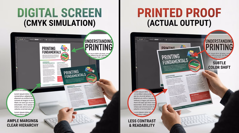
- text that is too small
- colors that shift darker or duller on paper
- margins that feel crowded
- images that look soft or pixelated
- unexpected cropping or scaling
🎬 Video: What Is Digital Printing? (video) — https://youtube.com/shorts/pxunJD8QqJI?si=gu4SKEaApL3YeDtw
Use this quick video as a visual reminder of what digital printing means in a production context.
Hardware and Software You Might Use
A basic digital printing setup could include:
- a computer or laptop
- layout or publishing software
- a digital printer, copier, or production press
- optional scanner if the workflow needs to capture a printed original
This option is also the easiest place to talk about software choices from Req 3 — Design Choices and Production Planning. Explain what you used and why. Maybe you needed a simple page layout tool, or maybe you used more advanced publishing software because your project included precise text and images.
What Makes This Option Strong
Digital printing teaches an important lesson in modern graphic arts: fast does not mean careless. Good files, thoughtful proofing, and clear production choices still matter. If your design is practical, readable, and ready on time, you are thinking like a working print professional.
If you want to see a more traditional, hands-on printing path, the next page explores relief printing.
Req 4d — Relief Printing Run
Relief printing lets you feel the roots of graphic arts in your hands. Instead of sending a file to a machine and letting the system hide the mechanics, you build the image physically. Raised areas take ink. Pressure transfers the image. Every step makes the printing idea visible.
The Core Idea
In relief printing, the image stands higher than the non-printing areas. Ink is rolled onto the raised surface, paper is pressed against it, and the printed image appears. This can happen with hand-set type, carved blocks, linoleum plates, or similar forms approved by your counselor.
That makes relief printing both simple in concept and demanding in practice. The design has to be prepared carefully, the plate or form must be assembled correctly, and pressure has to be controlled so the print is clear without being crushed.
Main Tasks for This Option
Relief Printing Workflow
Think through the physical setup before beginning the run- Prepare the layout: Decide what text or image will be printed and how it should be arranged.
- Set type or make the plate: Build the raised image surface your counselor approves.
- Lock up the form: Secure the type or plate so nothing shifts while printing.
- Ink and test: Print trial sheets and adjust pressure or alignment.
- Complete 50 copies: Once the result is clear and repeatable, run the full job.
Why Lock-Up Matters
If type or plates move even a little, the print can become crooked, uneven, or unreadable. Relief printing teaches that mechanical stability is part of design quality. A beautiful layout is useless if the form shifts during the run.
This option also shows why older print shops needed skilled craftspeople. Setting type, spacing letters, and balancing the press took patience. The process was slower than modern digital printing, but it trained printers to think carefully about every detail.
🎬 Video: Relief Printmaking (video) — https://youtu.be/vsMBA-1g-5U?si=MyzHQonzhXqkwloS
Watch for how the raised image surface is prepared and how pressure affects the finished print.
What Good Relief Prints Show
A strong relief print usually has:
- even ink on the raised areas
- clear text or image edges
- steady alignment from copy to copy
- no major slipping, ghosting, or smearing
- a result that matches the intended design
Some relief prints, especially artistic ones, may include slight variation. That does not always mean the print is bad. It may be part of the character of the process. Your counselor can help you tell the difference between acceptable handmade variation and poor setup.
Why This Option Matters
Relief printing makes printing feel real in a physical way. It also helps you appreciate how much of modern design still depends on old ideas: image areas, non-image areas, ink transfer, pressure, registration, and repeatability.
After producing your work, the next stage is what happens after the printing itself — cutting, trimming, drilling, padding, and binding. That is the focus of the next requirement.
Req 5 — Postpress and Binding
This requirement covers two parts of the job that happen after ink reaches the page: finishing operations and binding. Printing is only part of graphic arts. A stack of printed sheets is not finished until it is cut, shaped, organized, and sometimes fastened together in a way that fits the purpose of the project.
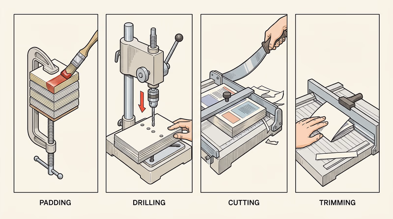
Requirement 5a: Finishing Operations
A project can be printed perfectly and still fail if the finishing is sloppy. Imagine a notepad with pages glued unevenly, a booklet cut crooked, or a form with holes punched in the wrong place. Finishing operations turn raw printed sheets into useful final products.
Padding
Padding means gluing sheets together along one edge so they form a tear-off pad. Memo pads and notepads are common examples. The glue has to hold the sheets firmly while still allowing clean removal.
Drilling
Drilling creates round holes through stacks of paper. Those holes may be used for storage in binders, wire binding, or organizing paperwork. Accuracy matters because misplaced holes can make the product look unprofessional or unusable.
Cutting
Cutting usually means slicing a large printed sheet into smaller pieces. A single press sheet may contain multiple copies of a flyer or card, so cutting separates them into finished units.
Trimming
Trimming is the final cleanup cut that removes excess paper and brings the printed piece to its exact finished size. It helps sharpen the final appearance and can remove bleed areas that extend beyond the trim line.
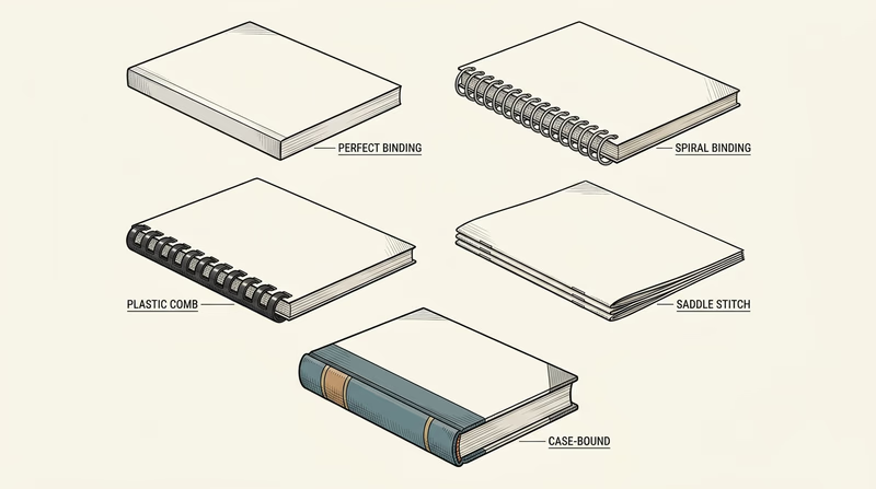
Requirement 5b: Binding Types
Binding is how multiple pages are held together. The right method depends on page count, cost, durability, and how the finished piece will be used.
| Binding type | What it is | Common uses | What to notice |
|---|---|---|---|
| Perfect binding | Pages are glued into a wraparound spine | Paperback books, thick manuals | Flat spine with printed title area |
| Spiral binding | A continuous coil passes through holes | Workbooks, notebooks, manuals | Opens wide and folds back easily |
| Plastic comb | A plastic spine with curved teeth holds punched pages | Reports, school projects, manuals | Easy to add or remove pages |
| Saddle stitch | Folded sheets are stapled along the fold | Booklets, programs, small catalogs | Best for thinner documents |
| Case binding | Pages are sewn or glued into a hard cover | Hardcover books | Strong, durable, and more expensive |
Collecting examples can be fun because these binding styles are all around you. A school agenda may use spiral binding. A church or awards program may be saddle stitched. A paperback novel shows perfect binding. A hardback reference book uses case binding.
🎬 Video: Book Binding Types: Wire Coil, Saddle Stitching, Burst, Perfect Binding etc (video) — https://youtu.be/t7eJKNFptzU?si=DDD-T90I4LBkQnM6
This video gives you a practical visual tour of several binding styles so you can identify them more confidently.
Book Binding Options: What Type of Book Binding Should I Use? (website) This guide compares common binding methods and explains why different projects need different finishing choices. Link: Book Binding Options: What Type of Book Binding Should I Use? (website) — https://www.48hrbooks.com/publishing-resources/blog/138/book-binding-options-what-type-of-book-binding-should-i-use?How Finishing and Binding Work Together
Finishing and binding are linked. A booklet may need trimming before it is saddle stitched. A notebook may need drilling before it gets a spiral. A paperback needs accurate trimming so the glued spine lines up correctly. When you explain this requirement, try to connect the steps instead of treating each one like an isolated fact.
This requirement helps you see that print production is not finished when the press stops. The next requirement shifts from making printed products to exploring real places and programs in the graphic arts world.
Req 6 — Choose a Graphic Arts Visit
You must choose exactly one option. This requirement is about seeing graphic arts in the real world, not just reading about it. Each option helps you follow information, design, and production through a different kind of environment.
Your Options
- Req 6a — Newspaper Printing Visit: Follow the path of a story from editing to layout to press. You will gain a strong look at deadlines, teamwork, and high-speed production.
- Req 6b — Commercial Printing Visit: Watch a customer job move through a retail, commercial, or in-plant print facility. You will learn how printers handle client needs, scheduling, finishing, and production decisions.
- Req 6c — School Program Visit: Explore a school-based graphic arts program and learn how training pathways are structured. You will gain a clearer picture of what classes and skills prepare students for the field.
- Req 6d — Professional Websites Research: With permission, study websites from professional organizations and printing-related companies. You will practice researching the field and comparing what different parts of the industry offer.
How to Choose
Choosing Your Visit Option
Pick the path that best fits your access and what you want to learn- Time and transportation: A plant or school visit requires scheduling and travel, while the website option can be done more flexibly with permission.
- What you will observe: Newspaper plants show fast editorial-to-print workflow; commercial shops show customer jobs from start to finish; school programs show training and preparation; websites show the wider industry landscape.
- Access to people: In-person visits give you chances to ask questions directly. Website research is better if local visits are hard to arrange.
- What you will gain: Option 6a builds understanding of publishing workflow, 6b reveals real production operations, 6c helps you explore education pathways, and 6d broadens your industry awareness.
No matter which option you choose, take notes during the experience. Write down what surprised you, what steps seemed most important, and how people in the field described their work. Those observations will make your counselor discussion stronger.
You are ready to start exploring the field beyond your own project work.
Req 6a — Newspaper Printing Visit
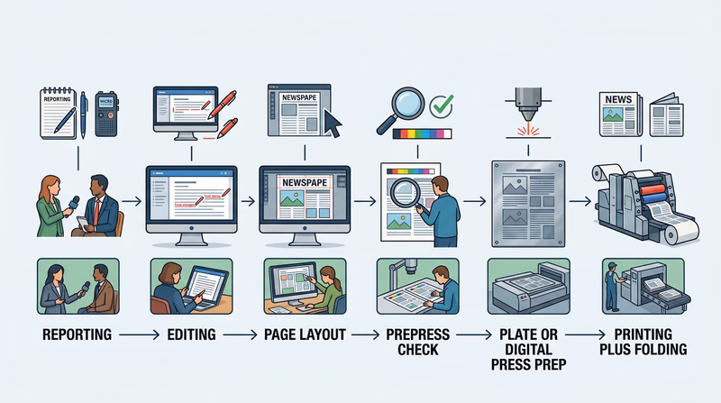
A newspaper story does not begin on the press floor. It starts with reporting, editing, layout, headlines, photo selection, and deadline decisions. By the time ink finally hits paper, many people have already shaped that story. This option is valuable because it shows how graphic arts connects writing, design, and high-speed printing in one fast-moving system.
What to Follow
When you visit, try to trace one story or page through the workflow. You may not be allowed to stand next to every step, but you can still ask how the process moves forward.
A typical path looks like this:
- a reporter gathers information
- an editor reviews and revises the story
- designers or page editors place text, headlines, and images into a layout
- the final page file is checked and sent to production
- plates or digital systems prepare the job for the press
- the press prints, folds, and organizes the paper
That path makes newspaper production a great example of teamwork. Graphic arts is not just about machines. It is also about timing, communication, and clear visual presentation.
🎬 Video: How The New York Times Is Made (video) — https://youtu.be/MrWP2z8I0Qk?si=zVnbTit-WqZa2BFD
This video gives you a broad look at how a major newspaper operation works from newsroom decisions to physical production.
🎬 Video: How Are Newspapers Made? (video) — https://www.youtube.com/watch?v=dEqMu7IVURE%20
Use this video to compare what you see on your visit with another newspaper production workflow.
Questions to Ask
Good Questions for a Newspaper Visit
Use these to help you notice the most important parts of the process- Where does the story change the most — reporting, editing, layout, or printing?
- How do deadlines affect page design and press timing?
- What printing process does the plant use, and why is it efficient for newspapers?
- How are photos and headlines prepared so they reproduce clearly?
- What problems can delay the paper from reaching readers on time?
What Highlights Might Matter Most
The “highlights” of your visit do not have to be dramatic. Good highlights are the details that taught you something real. Maybe you were surprised by how late pages can change before printing. Maybe you noticed how giant paper rolls are loaded into the press. Maybe the most interesting part was seeing how headlines, photos, and ads all compete for space on one page.
That kind of observation shows your counselor that you paid attention to how the system works.
Connecting the Visit to the Badge
This option ties together several earlier requirements. You will see printing processes from Req 1 — Printing Processes, image handling from Req 2 — Images, Halftones, and Digital Files, and layout decisions from Req 3 — Design Choices and Production Planning. A newspaper plant is almost like watching the whole badge come alive in one place.
If a newspaper visit is not available, the next page shows how a commercial or in-plant facility offers a different view of the field.
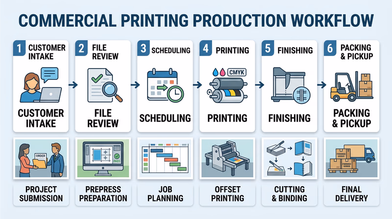
Req 6b — Commercial Printing Visit
A commercial print job often starts with a customer problem: “We need event programs by Friday,” or “We need product labels that hold up in a freezer,” or “We need an employee handbook that looks professional and opens flat.” This option helps you see how graphic arts professionals turn those requests into finished products through planning, production, finishing, and delivery.
What “Beginning to End” Usually Means
A print facility may handle many different jobs, but most follow a similar path:
- the customer explains the need
- staff review the file, quantity, paper, size, and finishing details
- the job is scheduled and prepared for production
- the piece is printed using the chosen process
- finishing steps such as cutting, folding, drilling, or binding are completed
- the order is packed, delivered, or picked up
That complete path makes this option one of the best ways to understand real-world workflow.
🎬 Video: Traditional Bookbinding | How It's Made (video) — https://youtu.be/DiCRx1_Ovok?si=B0uslGn7U9D6tGpI
This video is helpful for noticing how finishing and binding become part of the overall production chain.
🎬 Video: Flexographic Printing Basics (video) — https://www.youtube.com/watch?v=hTF_fgpWoTo%20
Even if your visit does not use flexography, this video broadens your understanding of how specialized print shops choose processes for different materials and products.
What to Notice During the Visit
Some jobs will move quickly, while others pause for proofing or finishing. Pay attention to how the staff make decisions.
- What kind of product is being made?
- Why was that printing process chosen?
- How do workers check quality before the full run?
- What postpress steps turn printed sheets into a useful final item?
- Which parts of the job require the most skill or caution?
Strong Visit Notes
These details make your later discussion much more specific- The product: What was being made and who needed it?
- The process: Which printing method did the shop use, and why?
- The bottleneck: What step seemed to take the most time or care?
- The quality check: How did the team confirm the job looked right?
- The finish: What happened after printing to complete the order?
Why This Option Is So Useful
A commercial or in-plant facility shows that graphic arts is not only creative. It is also a service business. Real customers have deadlines, budgets, brand rules, and practical needs. A print shop has to balance all of that while still making a product that looks good and works correctly.
This option also connects strongly to Req 5 — Postpress and Binding, because many facilities spend just as much effort on trimming, folding, punching, and binding as they do on printing.
Describing Your Highlights
Your best highlights will probably include one surprise, one workflow insight, and one detail about the people doing the work. Maybe you were surprised by how much proofing happened before the final run. Maybe you learned that the hardest part was finishing, not printing. Maybe you noticed how often workers solved small problems before the customer ever saw them.
Those are the kinds of things that show you understood the visit as a process, not just a tour.
If you want to learn how people prepare for careers in this field, the next page explores school graphic arts programs.
Req 6c — School Program Visit
One of the best ways to picture your future in graphic arts is to visit a place where people are learning it on purpose. A school program can show you how skills are taught step by step, from basic design and computer tools to printing, production, packaging, photography, and portfolio building.
What to Look For in a School Program
Some schools focus more on graphic design. Others include printing technology, commercial art, digital media, illustration, photography, or production workflows. The important thing is to understand how the program is structured.
As you visit, look for answers to these questions:
- What beginner classes do students start with?
- What more advanced classes come later?
- Are there prerequisite courses, portfolio requirements, or grade-level limits?
- Do students use real equipment, software, or production workflows?
- Does the program connect to college study, certifications, or industry jobs?
🎬 Video: Study Graphic Arts | Winchester School of Art (video) — https://youtu.be/GsC6_Ibhpp8?si=rWPM21zZDOd728xX
This video gives you one example of how a school can present creative study, studio culture, and skill development.
Top 50 Graphic Design Schools and Colleges in the U.S (website) This list can help you compare the kinds of schools and programs that train students for graphic design and related careers. Link: Top 50 Graphic Design Schools and Colleges in the U.S (website) — https://www.animationcareerreview.com/articles/top-50-graphic-design-schools-and-colleges-us-2023-rankingsCourses and Prerequisites
A prerequisite is something you must complete before taking a more advanced class. Schools use prerequisites so students build skills in the right order. For example, a beginner design class may come before advanced typography. Basic drawing or digital imaging may come before portfolio studio work.
If the program you visit has no formal prerequisites, ask what background or skills instructors still recommend. Sometimes a course is technically open to anyone, but students succeed more easily if they already know layout basics, software shortcuts, or design vocabulary.
Questions for the Instructor
These help you learn how the program is built- Which course should a beginner take first?
- What skills do students need before advanced classes?
- What software or equipment do students use most often?
- What kinds of projects do students complete?
- What jobs or further education does the program prepare students for?
What Might Stand Out
Your highlights might include the range of tools students use, the kinds of projects hanging on the wall, or the way the program blends creativity with technical production. You might discover that some students focus on branding and layout while others lean toward printing, packaging, photography, or motion graphics.
That is a useful lesson all by itself: graphic arts is not one narrow job. It is a wide field with many skill paths.
How This Helps With the Badge
This option connects strongly to Req 7 — Careers in Graphic Arts. By seeing how people train, you start to understand what kind of preparation different careers require. That makes it easier to choose one career path to research later.
If an in-person program visit is not available, the next page shows how to research the field by studying professional organizations and companies online.
Req 6d — Professional Websites Research
This option is a good reminder that graphic arts is much bigger than one local print shop. Professional organizations, suppliers, manufacturers, and printers all play different roles in the field. By comparing websites, you can see how the industry talks about itself, what services matter most, and what kinds of tools or support different groups provide.
A Smart Research Plan
Because you need permission, start by telling your parent or guardian what kinds of websites you plan to visit. Then choose a mix of sources so you see different parts of the field.
For example, you might compare:
- a professional association
- a supplier or manufacturer
- a commercial printer or specialty print company
That gives you a broader view than visiting three nearly identical sites.
GCEA - Graphic Communicators Education Association (website) This organization helps you see how educators and industry supporters promote graphic communications learning and career development. Link: GCEA - Graphic Communicators Education Association (website) — https://www.gceaonline.org/ Book Arts Associations (website) This directory introduces organizations connected to book arts, binding, printing, and related crafts across the field. Link: Book Arts Associations (website) — https://guildofbookworkers.org/book-arts-organizationWhat to Look For on Each Site
Do not just skim the home page. Try to figure out what the organization or company actually does.
Website Research Checklist
Use the same questions for each site so you can compare them- Who are they serving? Students, professionals, businesses, publishers, artists, or customers?
- What do they provide? Products, training, services, advocacy, equipment, or information?
- What part of graphic arts do they emphasize most? Design, printing, finishing, education, packaging, or careers?
- What did you download or print? Product sheets, service descriptions, course information, or organization materials?
- What surprised you? A tool, career path, service, or specialty you had not considered before?
Good Notes Lead to Good Discussion
When you meet with your counselor, it helps if you can compare the sites instead of listing them one by one. You might explain that one organization focused on education, another on equipment or supplies, and another on actual print services. That shows you understand how the field is made up of connected but different roles.
Why This Option Matters
This requirement teaches a real-world professional skill: learning how to research an industry. People in graphic arts constantly compare vendors, materials, equipment, services, and training options. The websites are not just for browsing. They are part of how professionals make decisions.
This option also sets you up well for Req 7 — Careers in Graphic Arts, because the sites you explore may introduce jobs and specialties you had never heard of before.
You have now explored how the field presents itself from the inside. Next, you will think about where a future career in graphic arts could take you.
Req 7 — Careers in Graphic Arts
Graphic arts is not one job. It is a network of creative, technical, and production careers. Some people focus on visual communication. Some run equipment. Some prepare files. Some manage clients, schedules, or packaging systems. This requirement helps you see that the badge is not only about making one project. It can also introduce you to a future path.
Three Career Paths to Explore
You can choose any three careers to discuss, but here are examples that show the field’s range.
Graphic Designer
Graphic designers create layouts, branding, packaging, posters, publications, and other visual communication pieces. They need strong design judgment, typography skills, software ability, and the habit of revising work based on feedback.
Prepress Technician
Prepress technicians prepare digital files so they will print correctly. They check size, color, image resolution, bleeds, fonts, and layout issues before the job reaches the press. This role is perfect for people who like accuracy, systems, and catching mistakes before they become expensive problems.
Press Operator or Print Production Specialist
Press operators run printing equipment, watch quality, adjust settings, solve mechanical issues, and keep production moving. This role combines technical skill, consistency, safety awareness, and attention to detail.
Of course, those are only three possibilities. Packaging designer, illustrator, bookbinder, sign specialist, creative director, production manager, and many other roles also fit under the graphic arts umbrella.
🎬 Video: Desktop Publishing as a Career (video) — https://www.youtube.com/watch?v=tuP-G9wJxmY
This video can help you think about careers focused on layout, digital publishing, and document production.
🎬 Video: Printing Press Operators (video) — https://www.youtube.com/watch?v=hOArtAsYeP8
This video is useful if you want to understand the more technical and machine-centered side of the field.
Graphic Design and Printing Career Guide (website) This career guide introduces multiple print and design jobs so you can compare roles, duties, and preparation paths. Link: Graphic Design and Printing Career Guide (website) — https://www.khake.com/page27.htmlWhat to Research for One Career
Once you pick one profession, go deeper. Your counselor will want more than a job title.
Career Research Checklist
Gather these details for the profession you choose- Education: Does the job usually require high school courses, a certificate, technical training, college, or a portfolio?
- Training: What do people need to learn on the job or in specialized classes?
- Experience: Do beginners start with internships, entry-level shop work, school projects, or apprenticeships?
- Skills: Does success depend more on creativity, software, machinery, communication, or quality control?
- Personal fit: What about the job matches your interests or strengths?
Explaining Why a Career Interests You
This part matters. Your counselor is not asking whether the job sounds impressive. They want to know whether you can connect the work to your own interests.
Maybe you enjoy combining art and technology. Maybe you like solving practical problems instead of making purely decorative work. Maybe you prefer machines and production to drawing. Maybe you like seeing a project become something real that people can hold.
Those are all valid reasons. Be honest and specific.
Looking Back at the Badge
By this point, you have already sampled many parts of the field: printing processes, image handling, design, production, finishing, visits, and research. Use those experiences to guide your career choice. If you liked Req 3 — Design Choices and Production Planning most, design-centered careers may appeal to you. If you loved Req 4 — Pick Your Production Path, technical production roles might be a better fit.
You have finished the badge requirements. The last page goes beyond the badge and shows where graphic arts can lead next.
Extended Learning
A. Congratulations
You finished the Graphic Arts merit badge, but you have really done something bigger than that. You learned how ideas become printed products, how design choices affect communication, and how production methods shape the final result. Those are useful skills whether you make posters for your troop, design a school event handout, help with a yearbook, or someday work in a creative industry. Graphic arts is one of those fields where art, engineering, communication, and problem-solving all meet.
B. Typography Is a Skill of Its Own
Typography means designing with type, not just choosing a font at random. Professionals think about hierarchy, spacing, rhythm, line length, and readability. Two pages can contain the exact same words and still feel completely different depending on the type choices. A crowded block of text feels tiring. A well-spaced page invites the reader in.
If you want to keep learning, start looking closely at menus, posters, packaging, game boxes, book covers, and museum signs. Ask what the type is doing. Is it formal, energetic, playful, serious, urgent, or calm? Does the heading stand out for the right reasons? Can you tell what to read first? This kind of observation trains your eye.
The deeper lesson is that typography is not decoration. It is part of communication. A strong type system helps people understand the message faster. That matters in safety signs, ballots, instructions, schedules, forms, and almost every other printed piece people depend on.
C. Packaging Design Changes How Products Compete
Packaging is one of the most interesting areas in graphic arts because it has to solve many problems at once. A package must protect the product, fit on a shelf, communicate important facts, meet legal rules, and still attract attention. That is much harder than making something look nice.
Next time you are in a grocery store or hardware store, compare five similar products on one shelf. Notice color choices, box shapes, label hierarchy, and how quickly each package tells you what it is. Some packages use bold graphics to grab attention. Others use a clean premium look. Some rely on trust and clarity more than excitement. All of those are graphic arts decisions.
Packaging also introduces new technical challenges. Designs may have to wrap around curves, fold across seams, line up with die cuts, or survive moisture and wear. That makes packaging a great path for Scouts who like design but also enjoy constraints and problem-solving.
D. Print and Digital Still Need Each Other
People sometimes talk as if print is old and digital is the future, but the real world is not that simple. Print and digital often support each other. A printed poster may lead people to a website. A product package may direct someone to a video tutorial. A school event may use both flyers and social media graphics. The best communicators understand how the two work together.
That makes graphic arts a strong field for someone who likes flexibility. You might design a printed brochure one day and adapt the same visual system into a web banner the next. Even if your future work is mostly digital, print teaches discipline. It forces you to think carefully about size, hierarchy, margins, color, production limits, and audience needs.
In other words, print is not outdated practice. It is a sharp way to learn how communication really works.
E. Real-World Experiences
Join a Yearbook, Newspaper, or Media Team
School publications are one of the best training grounds in graphic arts because they combine deadlines, layout, photography, editing, and teamwork.
Tour a Local Print Shop Again
If you enjoyed your visit for Req 6, ask whether you can return for a deeper look at prepress, finishing, or specialty printing.
Design for Your Troop or Community
Offer to make a campout flyer, event program, service project poster, or signup form. Real audiences give you better design practice than imaginary assignments.
Visit a Museum or Book Arts Center
Many museums and arts centers feature posters, historic printing equipment, artist books, or letterpress demonstrations that show the field from a cultural angle.
Build a Small Portfolio
Keep your best design pieces, notes, test prints, and finished products. A simple portfolio helps you see your progress and can become useful if you take classes later.
F. Organizations
AIGA
AIGA is a major professional association for design. It shares articles, events, and examples of real design work across many specialties.
Graphic Communications Education Association (GCEA)
GCEA supports education in graphic communications and helps connect learning with industry opportunities.
Printing Industries Alliance
This type of organization helps print professionals with training, standards, events, and industry updates. Regional alliances can also point you toward local connections.
Guild of Book Workers
This organization is especially interesting if you like book arts, binding, fine printing, and the craft side of graphic arts.
SkillsUSA
If your school has a chapter, SkillsUSA can offer competitions and career-focused experiences related to design, printing, and production.