Req 2 — Images, Halftones, and Digital Files
A photograph of your troop at camp, a black-and-white logo, and a comic-style dot pattern may all end up on the same printed page, but they are not built the same way. Printers need to know what kind of artwork they are handling because each type behaves differently when ink hits paper. This requirement is about learning how images are translated from art into printable information.
Three Common Artwork Types
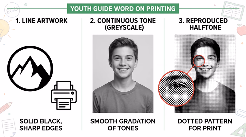
Line Artwork
Line artwork uses solid areas with clear edges and no gradual shading. Think of a troop logo, a simple icon, a map symbol, or bold black text. The image is either there or it is not. That makes line art crisp and easy to reproduce.
Because the edges are sharp, line art is often stored as vector art or high-contrast bitmap art. Vector art uses mathematical paths instead of individual pixels, which means it can scale larger or smaller without becoming blurry. That is why logos are often created as vectors.
Continuous Tone Artwork
Continuous tone artwork has smooth changes from light to dark. Photographs are the most common example. A face in a photo does not jump from one flat gray shape to another. Instead, it shifts smoothly through many values and colors.
Continuous tone images are great for realism, but printing presses usually cannot place infinite shades of ink. They need a way to simulate those smooth changes.
Halftone Artwork
A halftone is the printer’s trick for turning continuous tone into printable dots. Tiny dots of different sizes, spacing, or density create the illusion of shading. From far away, your eyes blend the dots together and see a photograph-like image.
That is why a newspaper photo may look smooth from your chair but reveal a pattern of dots when you look closely. Halftones are a key bridge between original image data and the physical limits of printing.
Why the Differences Matter
A printer cannot treat all artwork the same way. If you turn a logo into the wrong kind of file, the edges can get fuzzy. If you print a photograph without proper halftone handling, the image can lose detail or look muddy. Good graphic arts work depends on choosing the right kind of art for the job.
Here is a simple way to think about it:
| Artwork type | Best description | Common examples | What to watch for |
|---|---|---|---|
| Line art | Sharp edges, solid fills | Logos, icons, bold illustrations, text | Keep edges crisp and high contrast |
| Continuous tone | Smooth shades and color transitions | Photographs, paintings, airbrushed art | Needs careful image handling for print |
| Halftone | Dot pattern that simulates tone | Printed photos in newspapers and magazines | Dot size and screen quality affect detail |
How Digital Images Are Created
Digital images can start in several ways. You might create them by drawing in design software, photographing a scene with a camera, scanning a sketch, or building shapes and text in a page-layout program. No matter how the image starts, the computer stores it as data.
There are two main digital image systems to understand:
Raster Images
Raster images are made from tiny picture elements called pixels. Every pixel holds color information. Photos from phones and cameras are raster images. They work well for continuous tone pictures because thousands or millions of pixels can capture subtle detail.
The trade-off is that raster images depend on resolution. If you enlarge them too much, they become blurry or blocky.
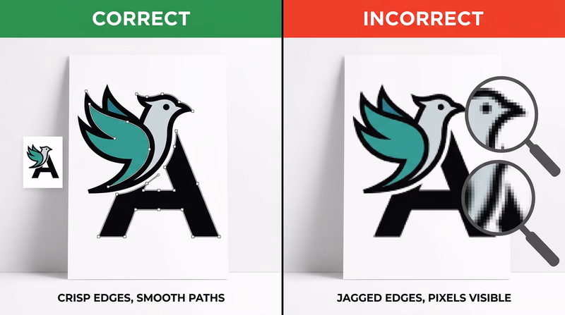
Vector Images
Vector images are built from points, lines, curves, and shapes described by math. A computer redraws them at whatever size you need. That makes them ideal for logos, lettering, diagrams, and line art.
In graphic arts, many finished designs combine both systems. A flyer might include a vector logo, raster photos, and text arranged together in one layout file.
How Computers Store Images
A computer can store images on an internal drive, an external drive, a memory card, or cloud storage. The more important idea for this badge is that files are saved in formats designed for different needs.
- JPEG or JPG is common for photographs because it keeps file sizes smaller.
- PNG works well when you need transparency or sharp-edged graphics.
- TIFF is often used in high-quality print workflows.
- PDF can package text, graphics, and layout into one print-ready file.
- SVG, AI, or EPS are common vector formats for logos and illustrations.
When you discuss storage with your counselor, explain not just where the file is saved, but also what form it takes. A file format affects quality, editability, and how ready it is for print.
Line Art, Continuous Tone and Halftone (website) This page shows visual examples of line art, continuous tone images, and halftones so you can compare them side by side.The article above is useful because it lets you see the categories instead of only hearing definitions.
This video is especially helpful for understanding how dots turn photos and shading into something a press can reproduce.
Watch this with one question in mind: what information is the computer storing so the image can be displayed, edited, and printed later?
A Good Counselor Discussion
A strong answer for this requirement explains both art types and computer storage. For example, you might say that line art has crisp edges and often works well as vector art, continuous tone artwork includes smooth shading like a photo, and halftones use dots to simulate that shading in print. Then you can explain that digital images are created with cameras, scanners, and software and stored as raster or vector files in formats such as JPG, PNG, TIFF, PDF, or SVG.
What you learn here will directly help with Req 3 — Design Choices and Production Planning, where you must design a printed piece and explain why your layout and type choices make sense.
You now understand the basic language of print artwork. Next, you will put that knowledge to work by designing something of your own.