Req 3 — Design Choices and Production Planning
A good printed piece does more than look cool. It has a job to do. A flyer must be readable at a glance. A form must guide the eye in the right order. A T-shirt design has to be bold enough to print well on fabric. This requirement asks you to think like a designer and a production planner at the same time.
Start With Purpose
Before choosing fonts or colors, decide what your printed piece is supposed to accomplish. Ask yourself:
- Who will use it?
- Where will they see it?
- How quickly do they need to understand it?
- Is it meant to inform, advertise, organize, or celebrate?
A troop event flyer, for example, needs one clear headline, important details, and easy-to-read text. A program for a ceremony might need a more formal look. A T-shirt design usually needs fewer words and stronger shapes.
Before You Design
Answer these questions first so your layout decisions make sense
- Audience: Who is this for — Scouts, parents, younger kids, or the public?
- Message: What is the one thing they must understand right away?
- Format: Will this be printed on paper, fabric, cardstock, or something else?
- Quantity: Do you need a handful of copies or a large run?
- Viewing distance: Will people hold it in their hands or see it from across a room?
Choosing Typefaces
A typeface is the design of the letters themselves. Typeface choice affects tone, readability, and how professional the piece feels.
A clean sans-serif typeface often works well for posters, flyers, and modern designs because it is simple and easy to scan. A serif typeface can feel more traditional or formal and may work well for programs or longer reading. Decorative typefaces can add personality, but they should be used carefully. If the headline looks exciting but the reader cannot decode it quickly, the design is failing.
A strong explanation to your counselor might sound like this: “I used a bold sans-serif for the headline so people can read it from a distance, and a simpler body font for the details so the information stays clear.”
Arranging the Elements
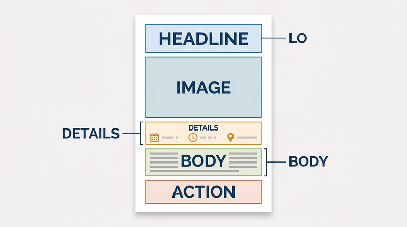
Graphic arts is all about visual order. You decide what the viewer notices first, second, and third. That is called hierarchy.
Important elements often include:
- headline
- image or illustration
- date, time, or location
- body information
- logo or sponsor line
- call to action
You can build hierarchy by changing size, weight, color, contrast, position, and spacing. White space matters too. Empty space is not wasted space. It gives the eye room to rest and helps important parts stand out.
If you crowd everything into the center, the design feels confusing. If you group related items and leave room between sections, the design feels organized and intentional.
Matching the Printing Process to the Design
This is where Req 1 — Printing Processes becomes useful. The best printing method depends on what you designed.
- A T-shirt or fabric item often points to screen printing.
- A short-run flyer or program usually fits digital printing.
- A large paper run such as many brochures or newsletters may fit offset lithography.
- A handmade art-style print could suit relief printing.
- A mass-produced packaging job could point toward gravure.
Your explanation should connect the process to the product. For example: “I chose digital printing because this event flyer only needs 40 copies, and digital printing is fast and does not require plates.” That is much stronger than simply naming a process.
This video is helpful for reviewing alignment, contrast, hierarchy, repetition, and white space before you finalize your piece.
This video gives you a quick tour of common design software so you can explain which tools fit your project and budget.
Hardware and Software
If desktop publishing is available, your counselor may want to hear how you would actually produce the file. You do not need a fancy studio. You just need to understand the basic workflow.
Hardware
Useful hardware might include:
- a computer or laptop
- a scanner for bringing in sketches or photos
- a camera or phone for original images
- a printer or digital press for proofs or final output
- optional drawing tablet, depending on the design
Software
Useful software might include:
- page layout software for arranging text and images
- illustration software for logos and vector art
- photo editing software for raster images
- presentation or publishing tools if more advanced tools are not available
The best answer depends on your design. A simple troop flyer could be built in a basic layout program and printed on a school or home printer. A more advanced shirt design might call for vector illustration software so the artwork stays sharp.
What Makes a Strong Badge Project
Your piece does not need to be perfect. It does need to show thoughtful choices. A strong project usually has:
- one clear purpose
- readable type
- organized layout
- a process choice that matches the job
- a basic explanation of how it would be produced digitally
This requirement leads directly into Req 4 — Pick Your Production Path, where you will actually produce the design using one printing method. So as you finish your design, think ahead. Which option could you realistically complete with your counselor’s help?
You have designed the piece. Next, you will decide how to bring it to life in print.