Req 4 — Choose Harmonizing Colors
Two colors can be perfectly nice on their own and still look awkward together. This requirement teaches an important part of painting that beginners often miss: good color choices are planned, not guessed.
What “harmonizing” means
Harmonizing colors feel like they belong together. They do not fight for attention, and they help the item or space look intentional. On a project like a stool, shelf, sign, or small piece of furniture, harmony can come from contrast, closeness, or balance.
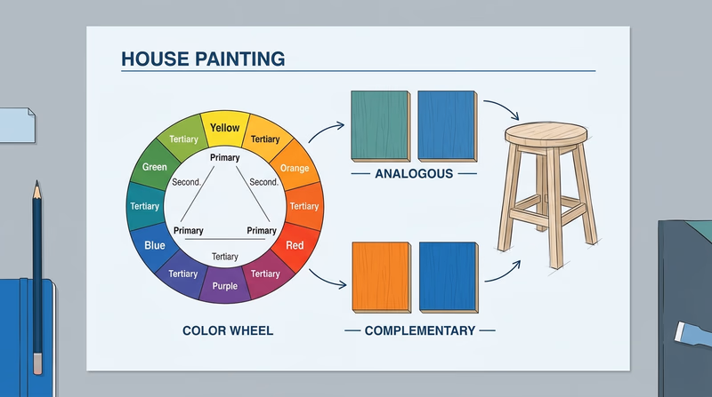
Common color-wheel relationships include:
- Analogous colors: next to each other on the wheel, such as blue and blue-green
- Complementary colors: opposite each other, such as blue and orange
- Warm and cool balance: one color may lead while the other supports
You do not need to memorize fancy design vocabulary. You do need to show that you chose your colors on purpose.
Start with the mood and the object
Before picking colors, ask two questions:
- What is this item for?
- What feeling should it give?
A toy chest might use brighter, more playful colors. A small shelf for a bedroom may look better with calmer tones. A garden sign might need stronger contrast so it is easy to read from a distance.
Simple ways to build a good palette
Use one main color and one supporting color
This is often the easiest plan for a Scout project. Pick a dominant color for most of the surface, then use a second color on trim, edges, legs, lettering, or a smaller accent area.
Pay attention to value, not just hue
Value means how light or dark a color is. Two colors can both be blue but still look very different if one is pale and one is deep. Contrast in value helps important details stand out.
Keep the finish in mind
In Req 2, you learned about sheen. The same color can feel different in a flat finish than in a glossy one. A shiny finish often makes color feel stronger and draws more attention.
Questions to ask before you paint
Use these to explain your color choices to your counselor
- Why did I choose this main color?
- Why does the second color work with it?
- Will the item be used indoors or outdoors?
- Will the colors still look good under the light where the item will live?
- Do the colors help important details stand out instead of disappear?
Use the official color wheel
Color Wheel from Painting Merit Badge Pamphlet (PDF) Use this official color wheel to test which colors sit near, across from, or balance each other before you paint your item. Link: Color Wheel from Painting Merit Badge Pamphlet (PDF) — https://filestore.scouting.org/filestore/Merit_Badge_ReqandRes/Requirement%20Resources/Painting/Painting_Color%20Wheet%20from%202025%20MBP.pdfThe color wheel gives you a visual way to defend your choices. If your counselor asks, “Why do these colors work together?” you can point to the relationship you used instead of saying, “I just liked them.”
🎬 Video: Choosing a Color Palette for Your Home (video) — https://www.youtube.com/watch?v=K75ynD7aAeg
A strong project process
- Pick the item you will paint.
- Decide where the item will be used.
- Choose your main color.
- Use the color wheel to find a harmonizing second color.
- Test both colors on scrap.
- Prep, prime, and paint with the finish that fits the item.
Once you can choose a finish and a color plan, the next skill is keeping your tools in good shape. Good tool care saves money and makes every future job easier.